Projects

This page lists some of my favorite projects where I’ve had a hand in the engineering work.
Table of contents:
- Lithos Carbon
- Just For Fun
- Splendid Spoon
- hims & hers
- Naked Labs
- Boosted Boards
- Tilt.com (Crowdtilt)
Lithos Carbon

Just For Fun
Playlist Pacer
I spend a good amount of time crafting my Spotify playlists for races. A key part of this is planning out which songs will play in key portions of the race.
I like to use slower tempo songs at the start and ramp up to my “fast / finishing songs” at the end of a race – helping me get the most out of the last minutes / finishing stretch.
To help with this, I built an app for myself that uses the Spotify API to import songs and overlay them on the course map via GPX files.
There’s also a “Preview course” button, which helps me visualize the songs along the route with autoplay.
Splendid Spoon
On-Demand Box store
The On-Demand Box (originally known as the “Stock Up Box”) is a product that allows customers to purchase Splendid Spoon meals without a weekly subscription.
Built while I was quarantining in a Bay Area hotel room in March 2020 after fleeing my NYC apartment, this was a very rewarding side project that took on a life of its own and has since evolved into a core product offering.
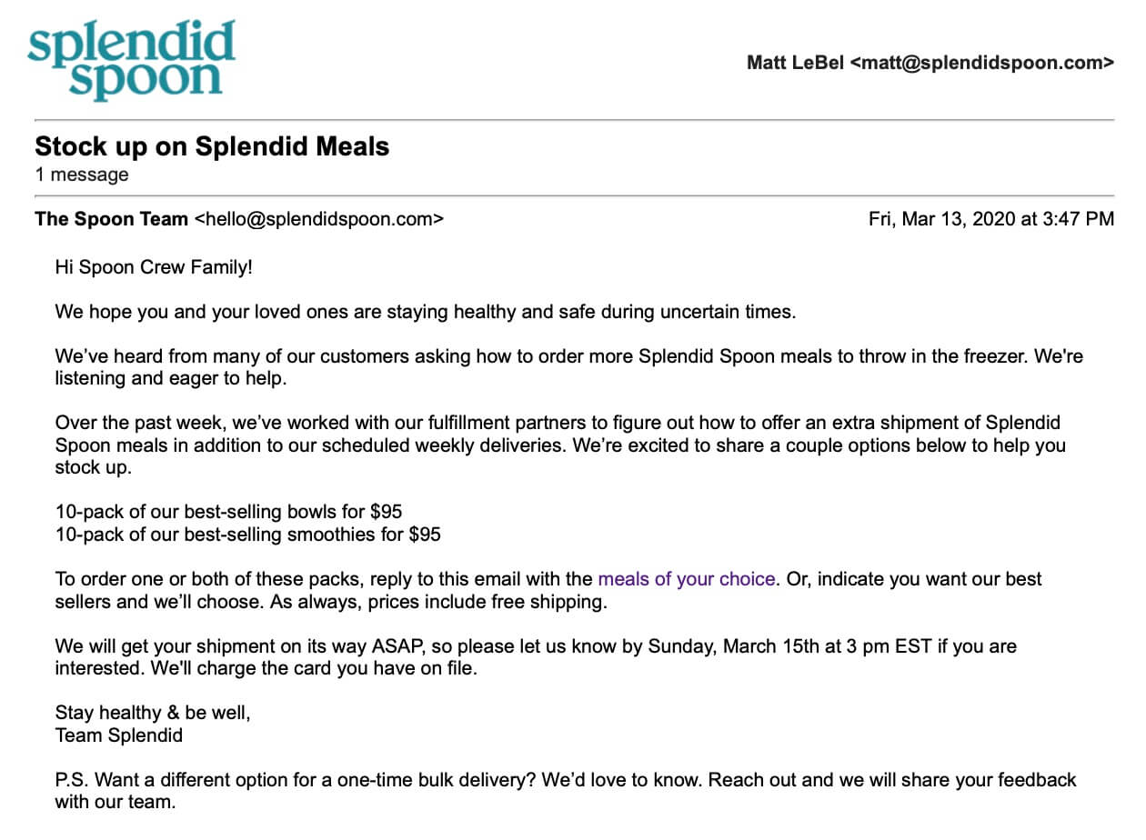
It all started as an MVP in the form of an email to help our weekly subscription customers get an extra delivery of meals during grocery store food shortages at the outset of the pandemic.
Our Customer Experience team was initially processing these email sales by hand - manually charging cards in Stripe while the Ops team was transferring orders from a Google Form into ShipStation for fulfillment. I took up the dev task to productize and scale our “Stock Up Box” program.
Paired with high customer intent, the slick single-page meal selection / express checkout flow (300 lines of jQuery in an index.liquid file using the Shopify JS Buy SDK) hit a 9%+ conversion rate in the first few months and later stabilized at a conversion rate above 12%.
Here’s a quote from a New York Times article where Splendid’s founder, Nicole Centeno, highlights this product and the foothold it was able to find during the pandemic:
The company developed a new product—a bulk box of its meals that comes in addition to the weekly subscription box. That is paying off, Ms. Centeno said, as new customers that see the bulk-box marketing online are clicking and purchasing it at a 9% rate.
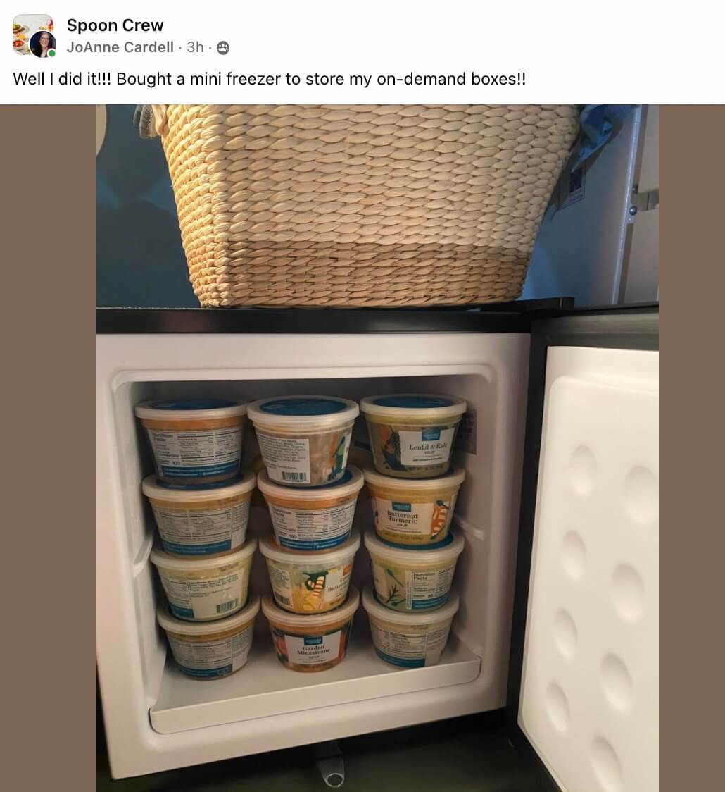
Eventually rebranded as “On-Demand Boxes,” this product developed a cult-like following among Splendid’s customers, with some even purchasing mini fridges to store their reserve stash of On-Demand Box meals.
Because the On-Demand Box was developed as a custom theme on Shopify, it proved to be an ideal place to rapidly iterate on conversion improvement ideas from our Marketing team and incubate Food Innovation product trials before migrating successful experiments onto the main site (a custom Django Ecommerce app with longer dev cycles).
We were also able to re-purpose the site for multiple use cases, including:
-
A redemption experience for use in Corporate Gifting campaigns (we were a holiday gift in 2021 for employees of Silicon Valley Bank, Smartwool, and more)
-
As a way to eliminate toil for our Marketing and Exec teams, who could now send a one-time use link to influencer / ambassador partners or potential employees to gift them a box of meals without needing to collect their shipping details by hand or ask them to signup for a subscription they’d later need to remember to cancel.
-
The “Holiday Gift Shop” for sales periods like Black Friday / Cyber Monday (highlighted in the video below)
Splendid Stats
In a nod to Spotify’s annual Wrapped feature, I used Bannerbear’s APIs to generate unique “Splendid Stats” stories as a holiday gift to each member of our team.
My favorite part of this data project was the “Meal Twins” stat, where I took two employees who had the same favorite meal and pitted their meal order count against each other to see who came out on top. 🏆
You can watch an example “Splendid Stats” story created for the Co-CEO, Elise, below:
SMS Delivery Reminders
Being a subscription product delivered on a weekly basis, one of the most common reasons for customers to request a refund from us was from forgetting to skip a delivery they didn’t want.
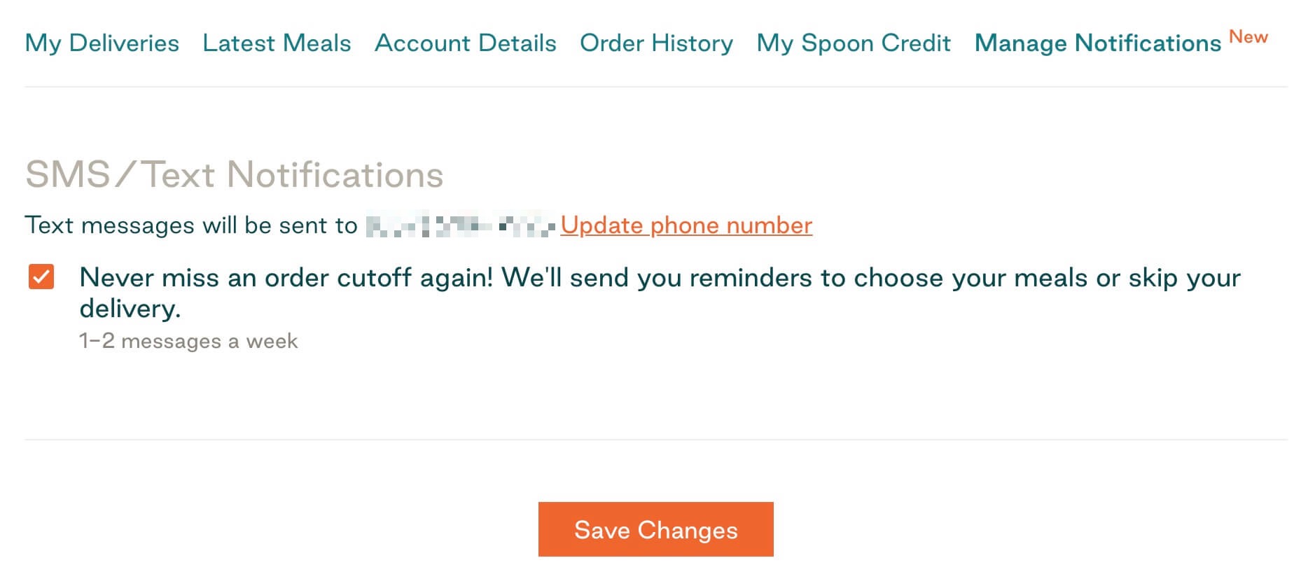
In an attempt to reduce this “Customer missed cutoff” refund volume, our CX team lead, Isaac, put together a compelling pitch for introducing SMS (text message) delivery reminders that would be sent in addition to our transactional email delivery reminders.
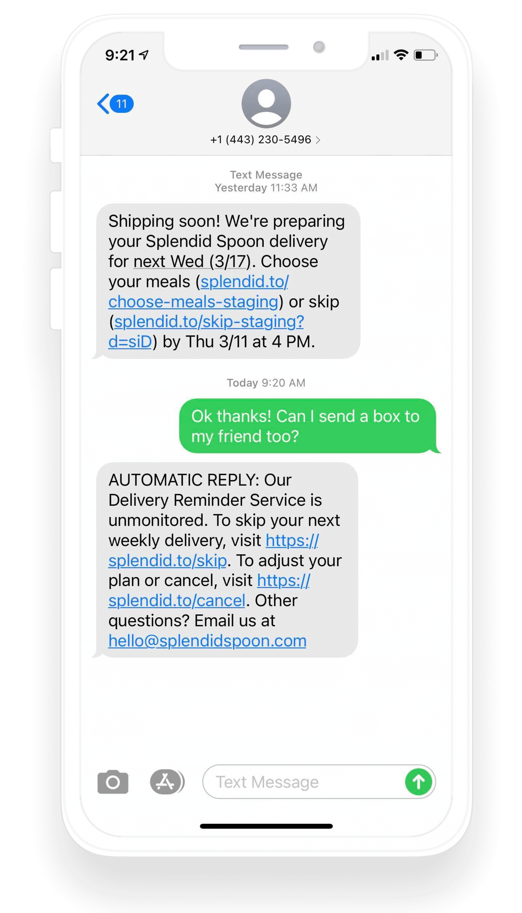
I built the proof-of-concept for this feature using Twilio’s APIs + Postman and, once validated, teamed up with Luan + Mariana to bring this feature to life.
I enjoyed working on the behind-the-scenes complexity required to go live with this feature, including:
-
Working with legal to rewrite our Terms of Service and Privacy Policy to allow transactional SMS messages (we also used this opportunity to update these docs to support Marketing SMS messages - something we launched shortly after).
-
Working with Tess to update our new user checkout flow to include opt-in placements promoting the new feature and designing a “Notification Center” page that would reflect the user’s global opt-in status from Twilio.
-
Working with Isaac and the CX team on a strategy to define default auto-replies, handle inbound SMS replies (piping them to a Slack channel), and setting a custom synthetic voice message to be read if users tried to call the SMS sending number.
A fast follow to the SMS Delivery Reminder feature was “One-Click Skip” — a dedicated flow where customers could skip a specific delivery date without needing to log into the full user dashboard.
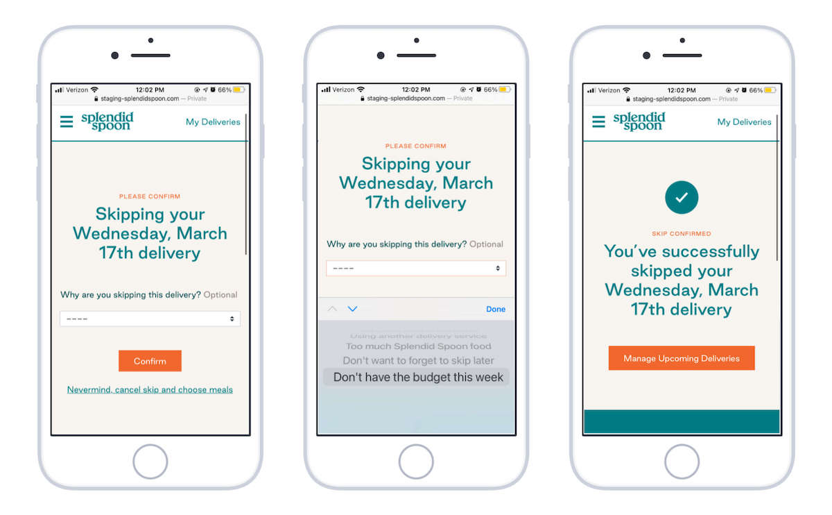
With a unified URL structure implemented by James, we were able to roll out One-Click Skip in both transactional SMS and email reminders, extracting valuable data about why customers were skipping delivery weeks - something our CX, Product, and Marketing teams did not previously have access to.
SMS Delivery Reminder key results:
- 90%+ opt-in rate for new customers at checkout
- Reduced “missed cutoff” refund support tickets significantly. Before release of the feature, we received tickets from from >2% of users each week asking for a refund. After release of the feature, refund tickets from users who had SMS Delivery Reminders enabled dropped to a rate of just 0.04%.
- New “Why did you skip?” analytics / product signals exposed in Amplitude for our Product, Marketing, and CX teams
Post-Purchase Upsell Lightbox
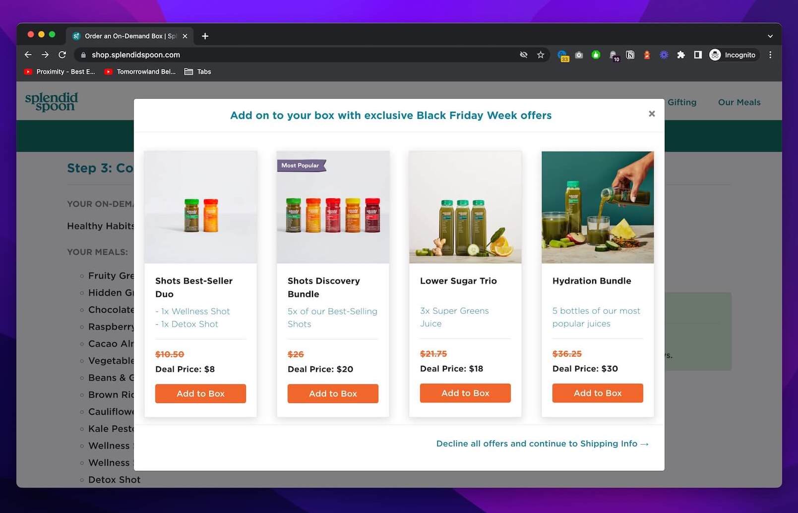
Inspired by a sharp checkout experience at Curology, I set out to bring to life a post-purchase upsell experience for Splendid Spoon that would increase platform AOV and provide some education, product discovery, and category cross-sell for new subscription customers.
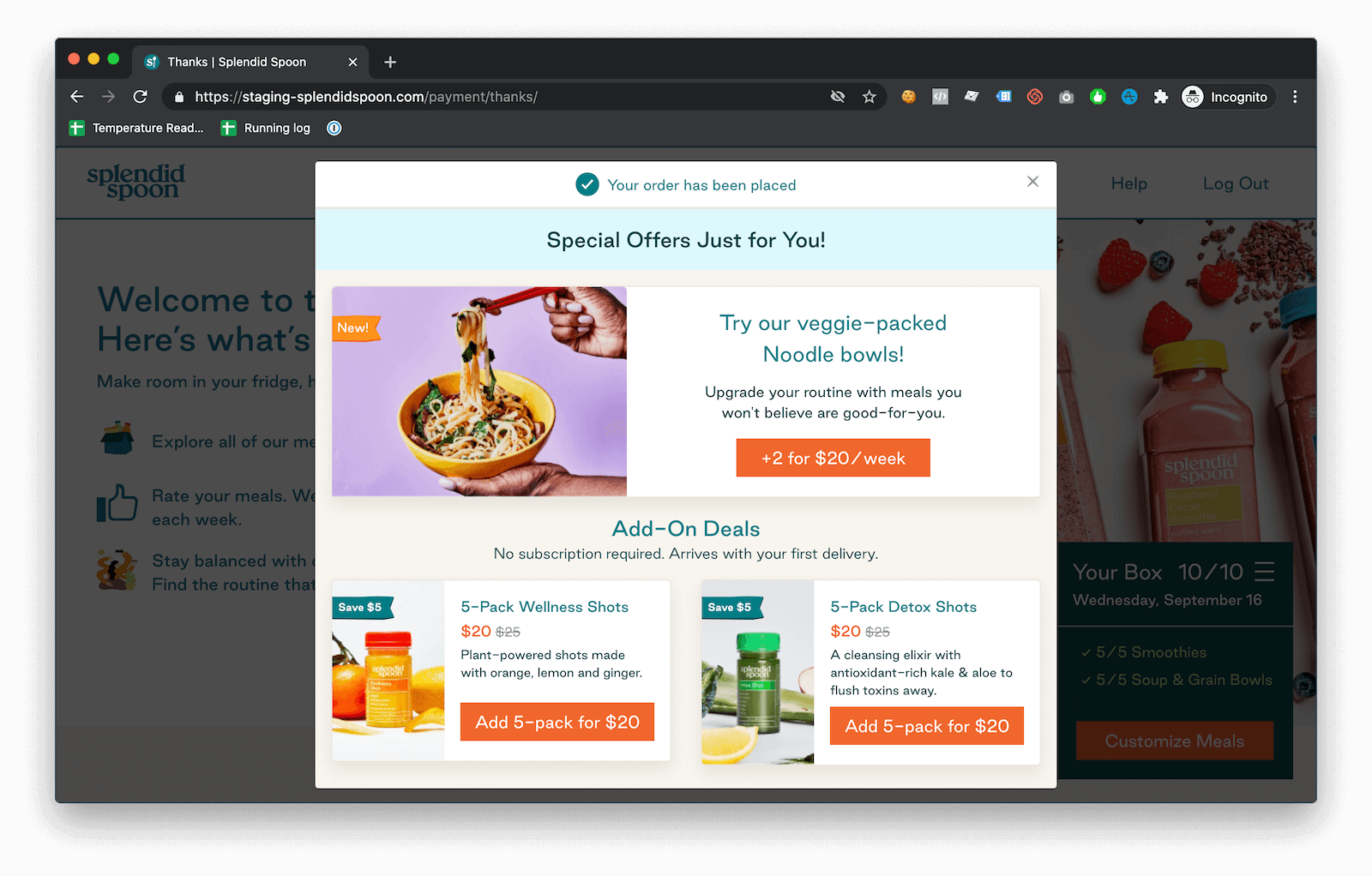
Key elements incorporated into this post-purchase upsell placement to prevent it from being confusing or spammy included:
- No countdown timers or “fake deals”
- One-click add to cart — no need to enter payment information again
- A clear confirmation that their order had already been successful and that this was a special offer - not another step of checkout that they had to complete
- Contextual offers - only show deals that were relevant to the user (if they already subscribed to the Noodle category, don’t show them “+2 Noodles for $20/week”)
- Support for upselling both recurring products (food categories) and one-time purchase items (add-ons)
Teaming up with Tess and Luan, we designed and implemented a version of this feature on our subscription offering.
The results? Over 20% of users began accepting one or more of these offers as part of their initial subscription checkout - far exceeding our expectations.
Building on the success of this feature, I later worked with Sadie and Henry to bring a similar upsell lightbox to life on our non-subscription offering, the On-Demand Box store.
Chrome extensions for teammates
While working at Splendid, I built a couple of Chrome extensions to help our team with small tasks.
The first, Standup Order, was a simple extension that would keep track of the lineup for our morning dev Standup.
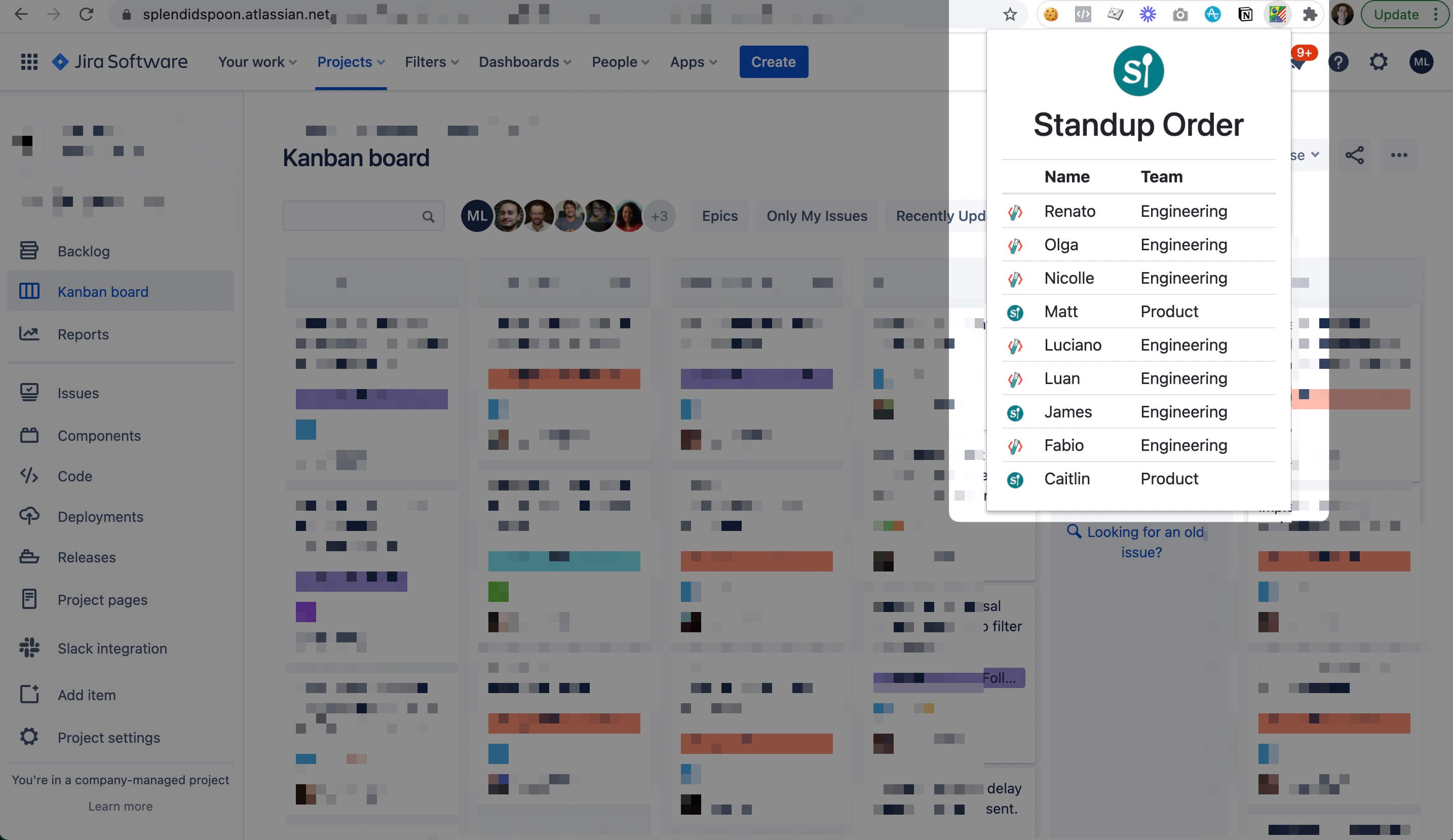
We had a tradition of reversing the order in which we started each week, and this extension automatically handled that based on the week index.
I also had fun publishing new versions of this extension to include celebratory, “Welcome to Splendid!” messages each time a new teammate joined and was added to Standup.
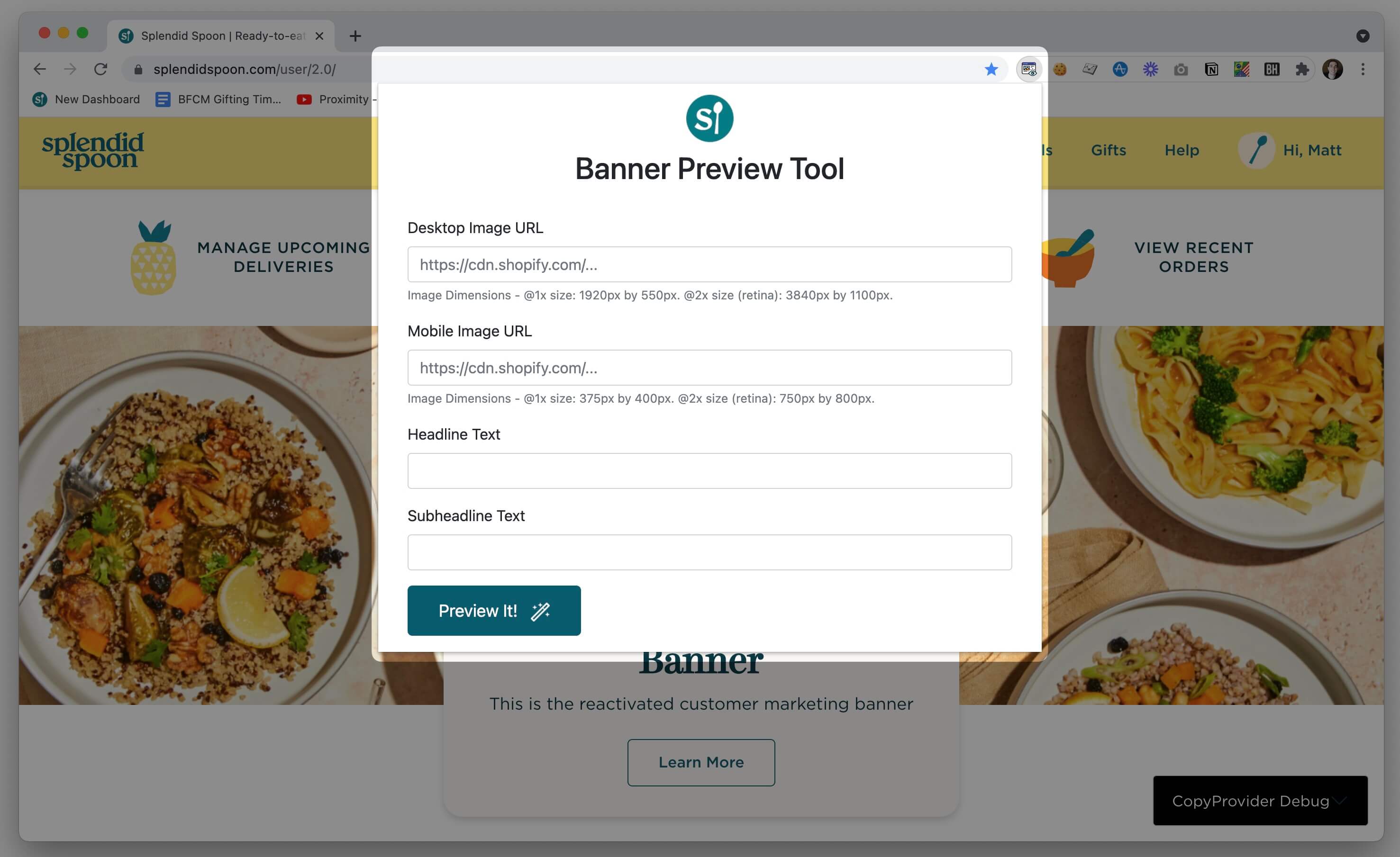
The second extension that I built was Banner Preview, a tool that allowed the Marketing team to preview how image and text changes to marketing content would appear in our customer dashboard before submitting the image + copy to the dev team for implementation (this was during a redesign period where there was not a CMS interface for the Marketing team to change it themselves).
Wellness Shot launch
For the launch of the new Wellness Shots product line in early 2020, I worked with beautiful designs from Tess to bring to life this landing page.
hims & hers
I was a dedicated developer resource (contract) for the growing Marketing team at hims, a DTC healthcare startup. Later on, I helped support the launch of the hers brand.
Working alongside Emily, Quentin, Shrishti, and Sara, I triaged a variety of technical tasks to unblock Marketers and amplify their impact.
Landing pages
The hims Marketing team was pragmatic in selecting tools that their team was already familiar with. In coordination with the hims internal Tech team, we chose Wordpress (secured and deployed with WP Engine) as the foundation for our hand-crafted page templates.
Paired with Advanced Custom Fields to provide a great editing experience for Marketers, we took Sketch / Figma files and brought 20+ unique templates to life over the course of a year and a half.
Alongside the hims team, I helped scale development on this landing page platform to include several developers at outside agencies and we later used the same platform to launch some of the initial Hers paid social landing pages.
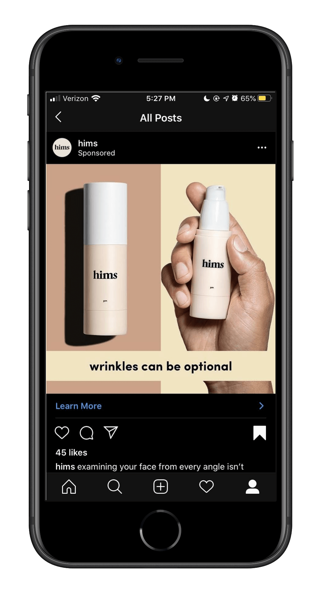
These pages stood up to some intense traffic (including direct ad links from the largest adult video website) without breaking a sweat, but the real win was in how usable they were for the Marketing team – they cloned the initial ~20 templates into 50+ unique landing pages tailored to match the channel / ad campaign content.
In an era where sloppily-implemented headless CMS systems and broken builds were becoming the bane of Marketers everywhere, I’m proud of the editing experience we were able to build with Wordpress to buy some time for Webflow to take over :)
Quiz proofs-of-concept
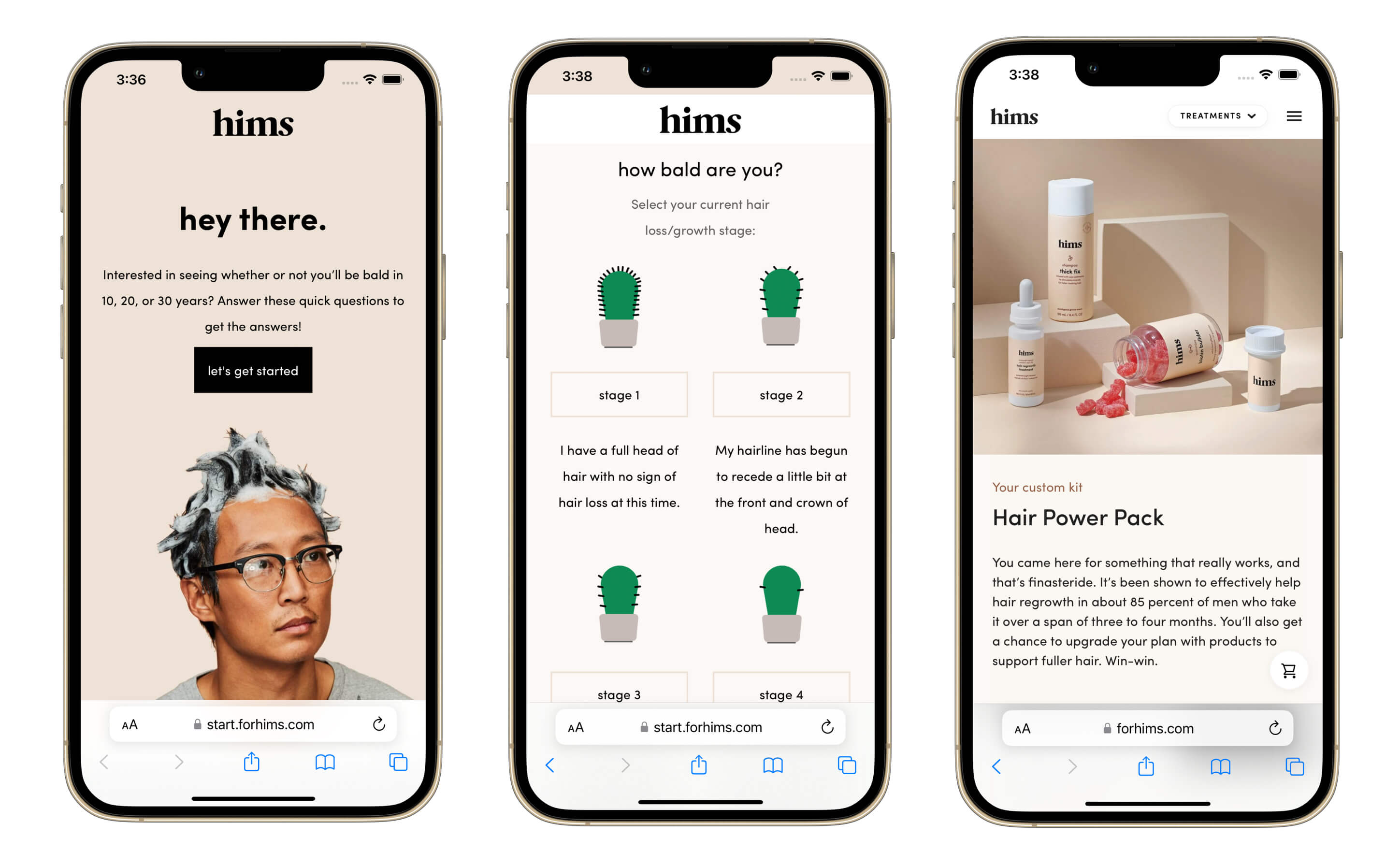
We built proof-of-concepts for several features that would eventually make their way into the core product. One of these concepts was an acquisition quiz that could help guide the user to the right hims hair products.
Naked Labs
Naked Labs developed a 3D Fitness Scanner that utilizes Intel RealSense depth sensors to create detailed 3D body scans. These scans provide a variety of measurements, including body fat percentage, lean mass v.s. fat mass, and body circumferences. The scanner also offers side-by-side comparisons and graphs of historical data, enabling users to efficiently and effectively track fitness progress over time.
An early customer of the Pre-Order Deposits product I worked on at Tilt, I later joined the Naked Labs team as an extra set of hands to help with the transition from pre-order to production and later, general availability.
Working with Alli, Ed, and Farhad, we got as much juice as we could out of the pre-order deposit campaign before we began work with an external agency to migrate to a headless Shopify Ecommerce setup in advance of general availability.
This was an incredibly rewarding product to help launch (thanks to Tommy for landing this iJustine video) and I’m still a proud user of the scanner to this day.
Customer Portal
![]()
Working with Alli, Michael, Lauren, and Jaime, I brought to life a hand-crafted Customer Portal that drew inspiration from the Dominos Pizza Tracker. Tons of attention to detail on this one, including some delightful illustrations from Jaime that we brought to life with Lottie.
Customers accessed this portal via a unique link in their pre-order deposit email and were able to access the status of their order’s manufacturing and shipping status, along with company updates.
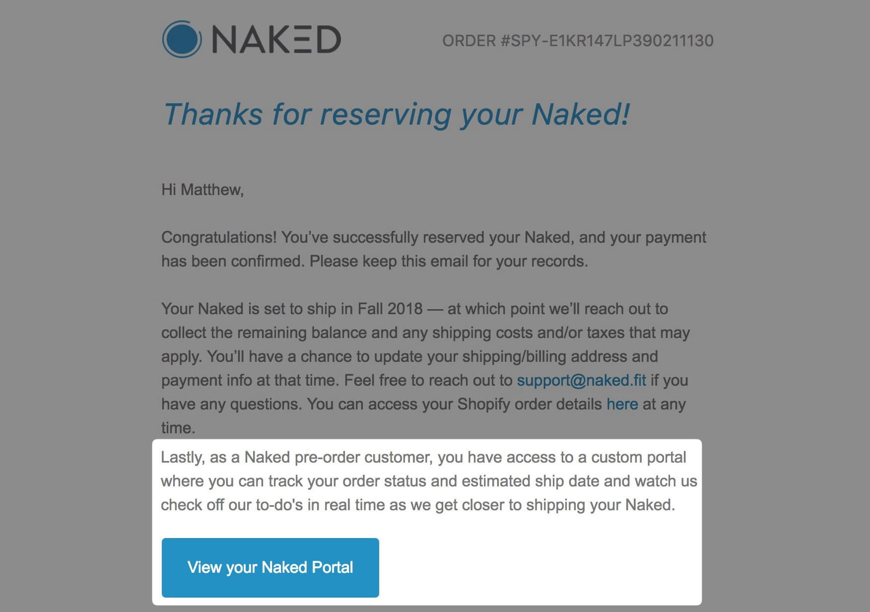
In combination with a thoughtful communications strategy from Alli, Ed, Lauren, and Farhad, this customer portal helped keep our refund rate ~50% lower than industry average for a deposit pre-order campaign with multiple delays.
Building mini apps for the Customer Support team
Support teams have a special place in my heart and I love building tools for them - from Zapier automations to mini apps to reduce toil.
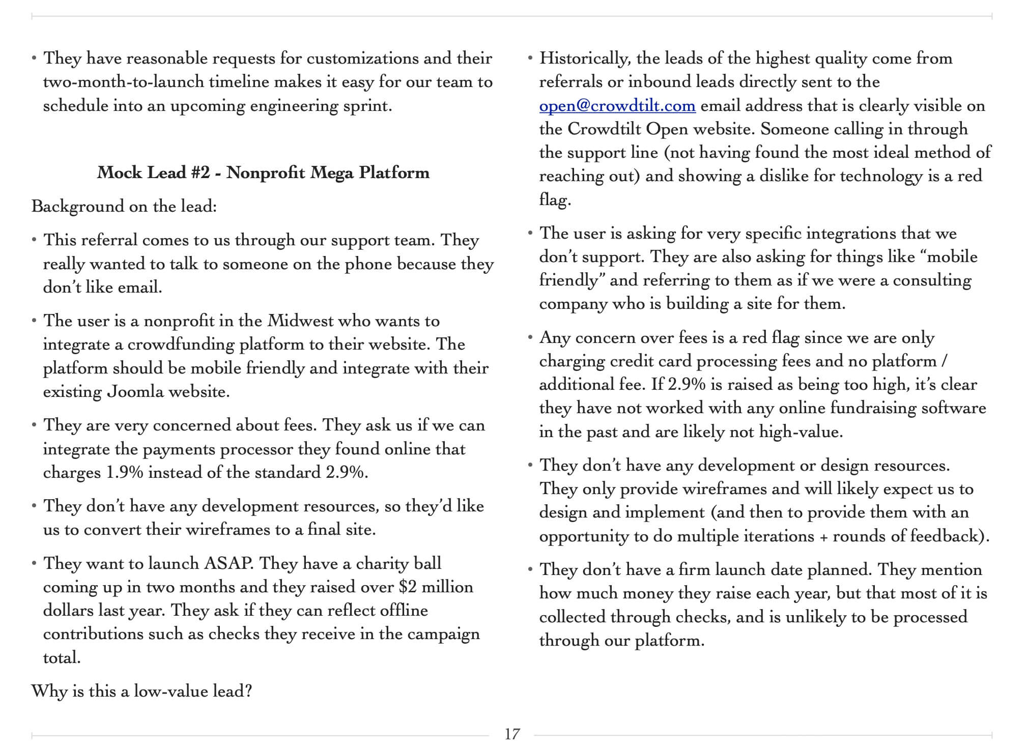
In one check-in meeting to talk about some customer feedback on our checkout flow, we discovered that the team had been manually transcribing data from Shopify checkout links into a Google Sheet / Form about 25 times per week.
Based on this feedback, I built a small app that eliminated the need to do this manually. We used a variation of this initial framework to help automate several other things throughout the pre-order and fulfillment process.
Boosted Boards
Above: The Boosted logo made up of code I wrote during my time with the team
This was my first chance to work on a brand with a truly fervent consumer following. I had a blast joining the team on group rides around SF and working weekend pop-up shops at local retailers.
Dynamics like the “Casey Neistat effect” made our job interesting. We had to be careful about development site leaks, configure Zapier monitors for mentions on the r/boostedboards subreddit, etc.
This was the role where I first handled DMCA takedown notices for leaked images in YouTube videos, bad actors cloning our Shopify store and selling fake boards, etc. Lots of IP protection work.
I worked with the team as the Ecommerce Developer for the Gen 2 and Gen 3 board launches, crossing paths with some incredible people — Hayden, Kyson, Kerry, Emily, Sara, Noriko - the list goes on.
Gen 3 Launch - Boosted Mini
While previous Boosted launches had been done with a crowdfunding or pre-order model, the Gen 3 board launch was the first to roll out with general availability - meaning that boards would be shipped to customers within 30 days.
I was responsible for the Shopify checkout experience, updating the legacy homepage of the website to showcase the new boards, and coordinating the launch day rollout across three web properties (Wordpress deployed on WP Engine w/ Cloudflare in front of it, a Next.js app developed by a 3rd party agency, and our Shopify theme).
Together with Kyson and Hayden, we also built a “Teaser” homepage variant - incorporating a background video from the launch video - to use in the 24 hours leading up to launch.
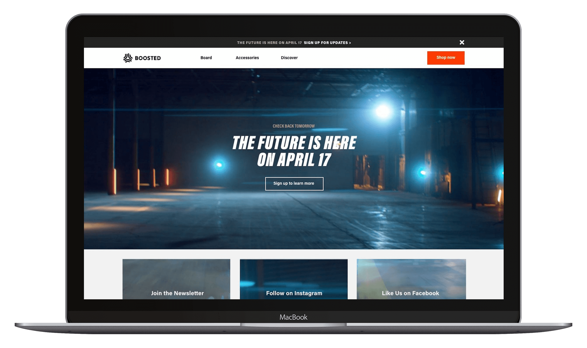
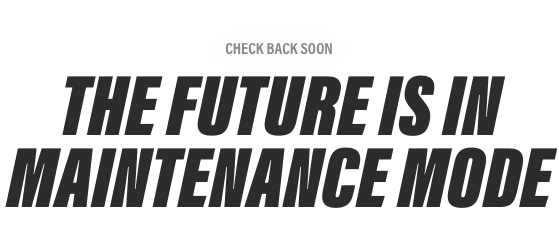
This launch was incredibly well-executed, with Kyson producing an on-brand graphic for me to use while the site was in maintenance mode and Hayden remixing some mind-blowing beats.
For a deeper dive into the production behind this launch, don’t miss these beautiful overviews from our designers Kyson Dana and Hayden Shaum.
Black Friday / Cyber Monday Campaign
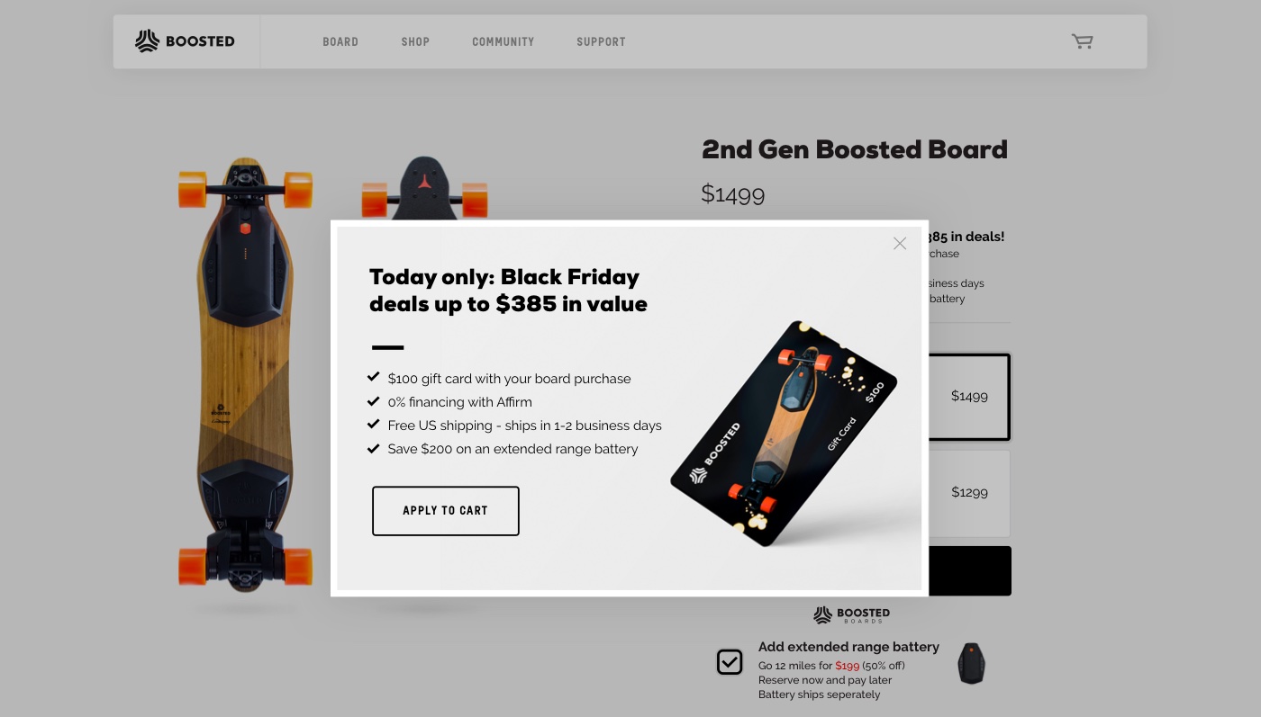
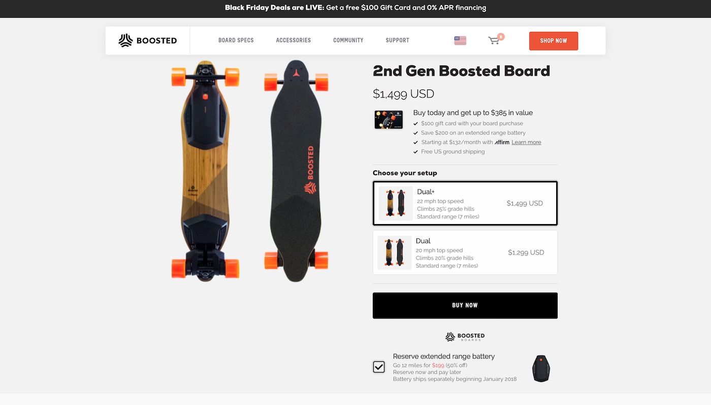
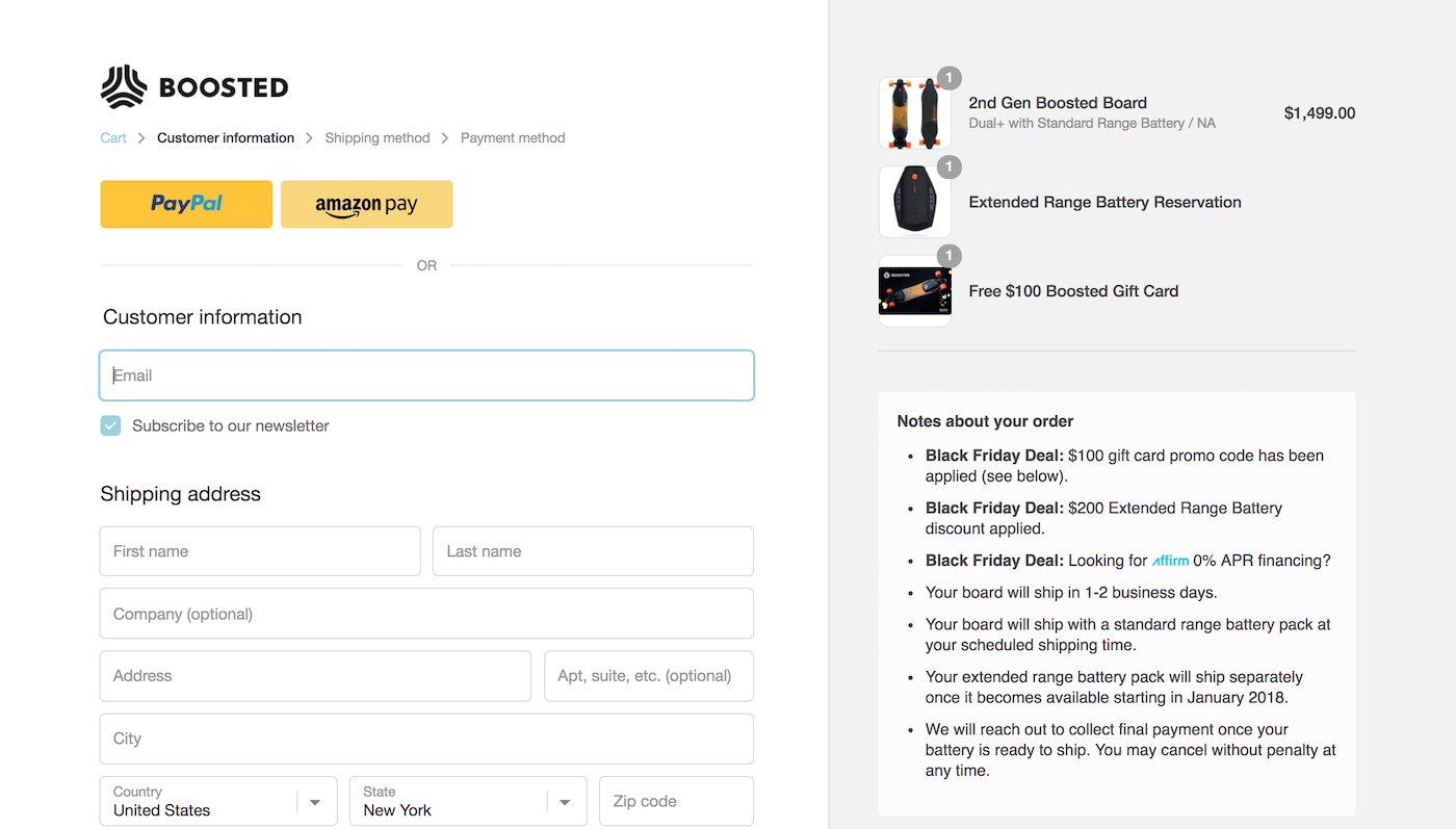
For our 2017 holiday BFCM campaign, I worked with designs / marketing specs from Kyson, Kerry, Emily, Sara, and Noriko to implement the promotion through visual touchpoints along the entire purchase journey, spanning email capture -> product page -> payment information page -> checkout confirmation email.
Incentives offered included:
- A $100 Gift Card (issued via Shopify)
- A discount on the optional Extended Range Battery
- An optional 0% APR financing via Affirm
Multi-Channel "Gift with Purchase" helmet promo
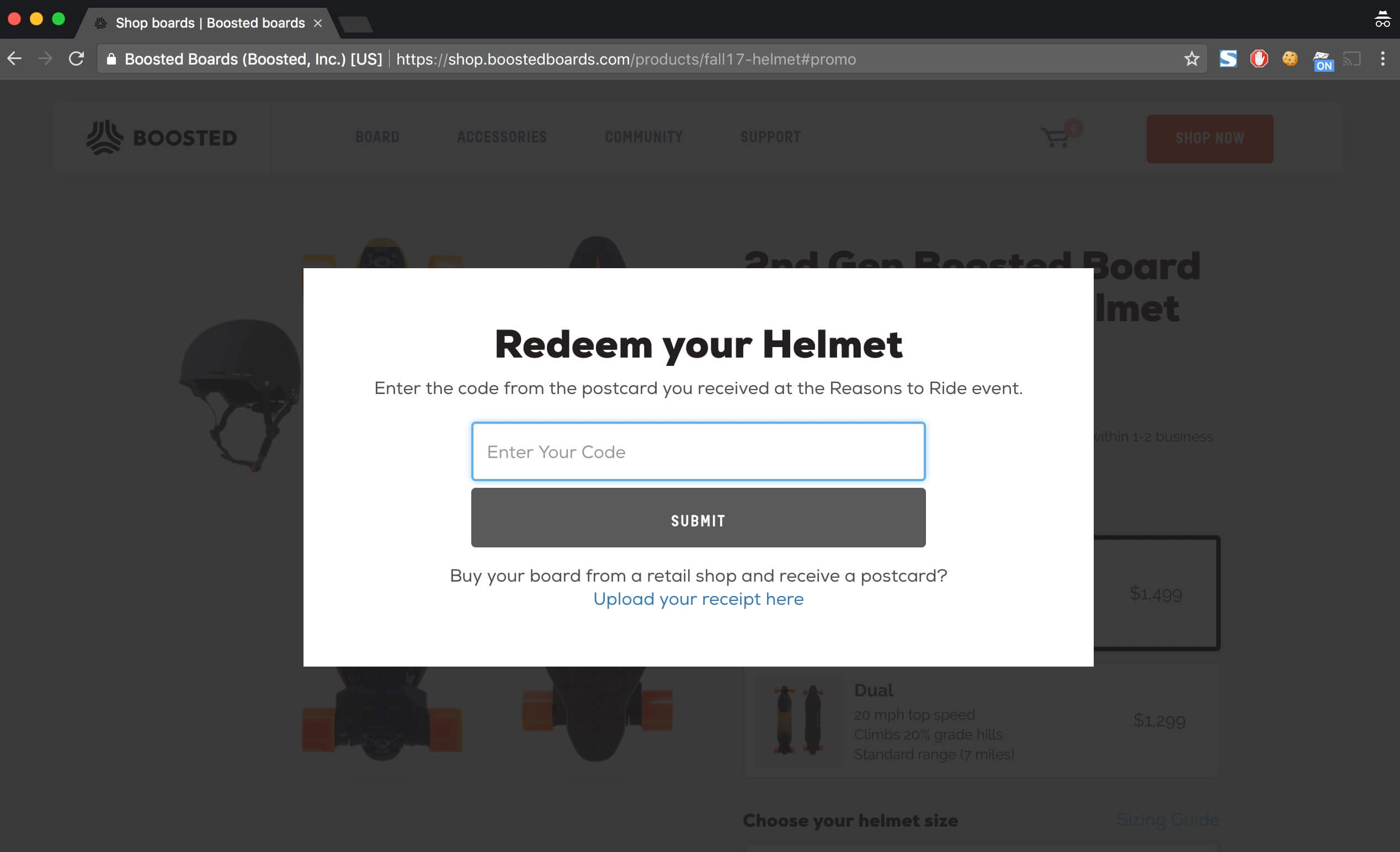
Tasked with providing the same “Free helmet with purchase” offer that we had running on boostedboards.com to our skate, surf, and bike shop retail partners, I worked with Kerry and the Marketing team to build an end-to-end flow to handle this multi-channel promotion.
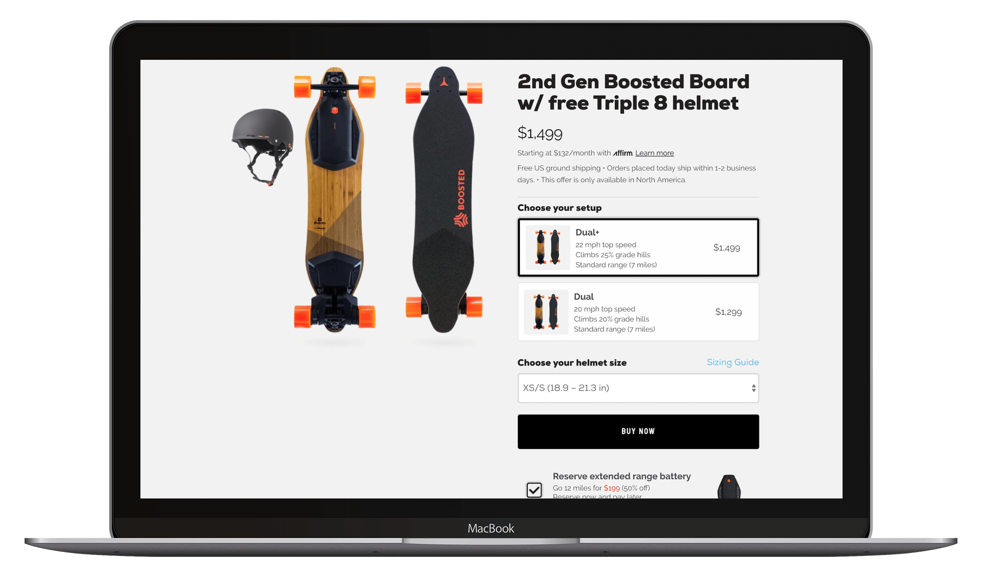
In addition to the website, there were several physical points where customers could enter the promotion flow:
-
Customers who attended an event hosted by our Boosted corporate team or ambassadors would receive a postcard with a one-time use code printed on it.
-
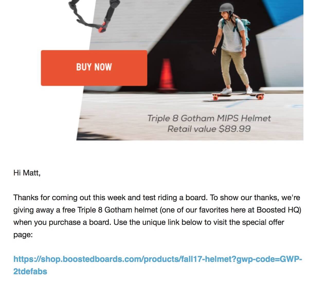
Customers who took a demo ride on one of the boards at an event (providing their email when they signed our waiver) would be sent a unique link highlighting the promotion via an email automation.
-
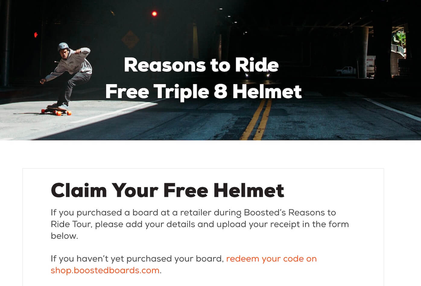
Customers who purchased from a retail partner would be able to submit proof of their purchase by submitting a receipt to an online form.
Regardless of the entry point above, customers would eventually arrive on the redemption landing page. On this page they’d see a place to enter their unique code, select their helmet size, and checkout with the free helmet added to their order.
Tilt.com (Crowdtilt)
Pre-Orders
In 2014, Henry, Sam, and I built a new Pre-Orders product during a company hackathon at Crowdtilt.
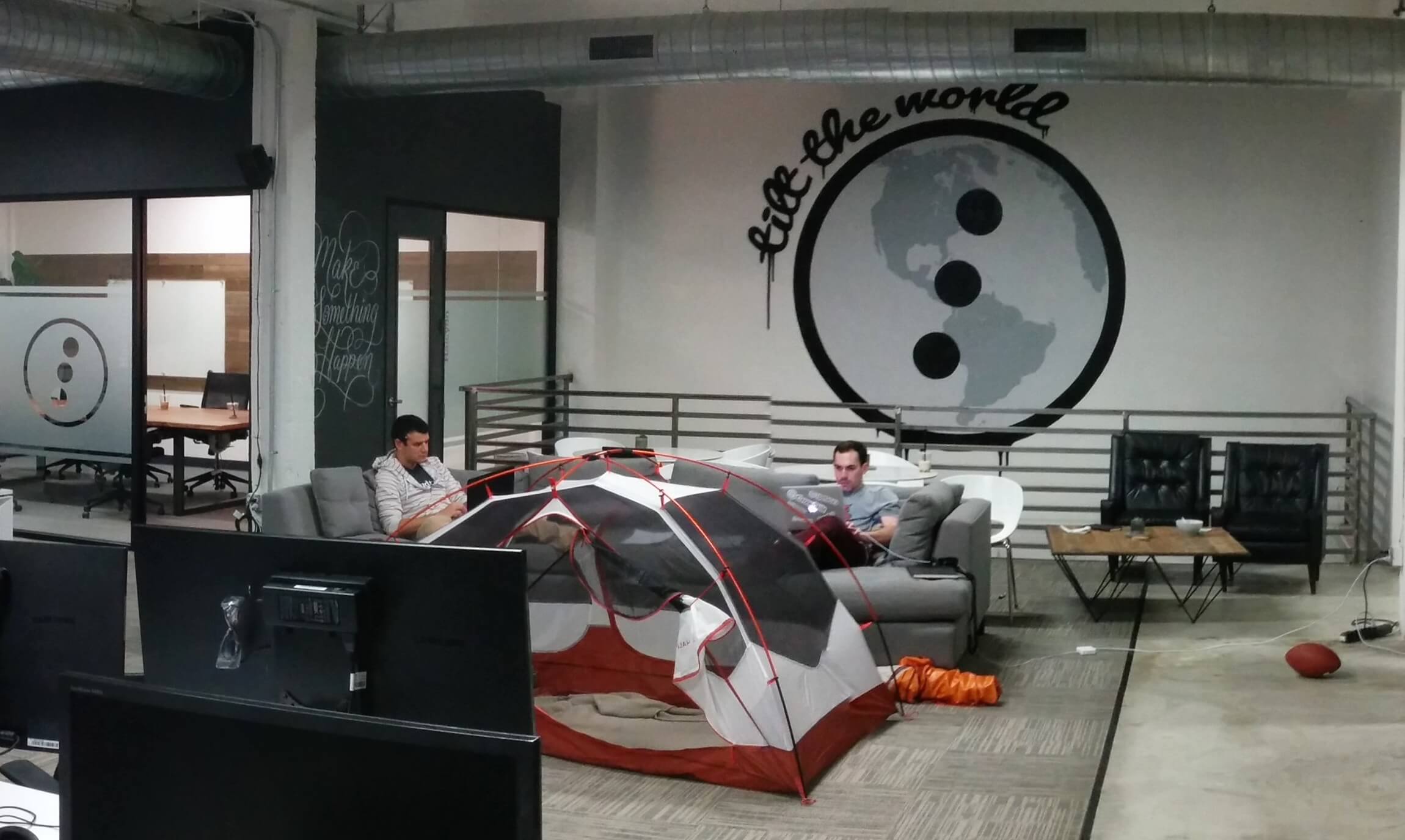
Drawing inspiration from Coin’s simple pre-order form and Stripe’s “two-lines of code” checkout.js, Crowdtilt Pre-Orders became our fastest-growing product ever with a viral loop via the small “Powered by Crowdtilt” logo at the bottom of the payment form.
We’d constantly wake up to surprise spikes in payment volume, finding that a new creator had launched a campaign using our self-serve tool.
Our success with this product came from our small team’s ability to spot market trends a few weeks before the rest of the industry caught on, find a brand (and founder) who wanted to be a launch partner to trial the new feature, and code / market it with urgency. We were mini founders and took great pride in the product and momentum we were building.
This remains the “golden era” of product development that I’ve been around and the technical / product team that surrounded me (hello to Henry, Ajay, Tiff, James, Will, Grant, Sam, and Johann if you’re reading this!) continues to have huge impact across the industry.
You can read more about the initial Crowdtilt Pre-Order product launch in this article from Crowdfund Insider.
Notable Pre-Order Campaigns
This was the age of Adam and the “Sandwich Video” and we worked quickly to build all the features needed for a viral campaign (referral links, built-in pre-launch pages, completely customizable payment forms / emails to match the brand, etc.).
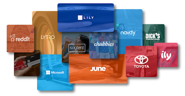
Some of the notable brands that collected pre-orders with our product included:
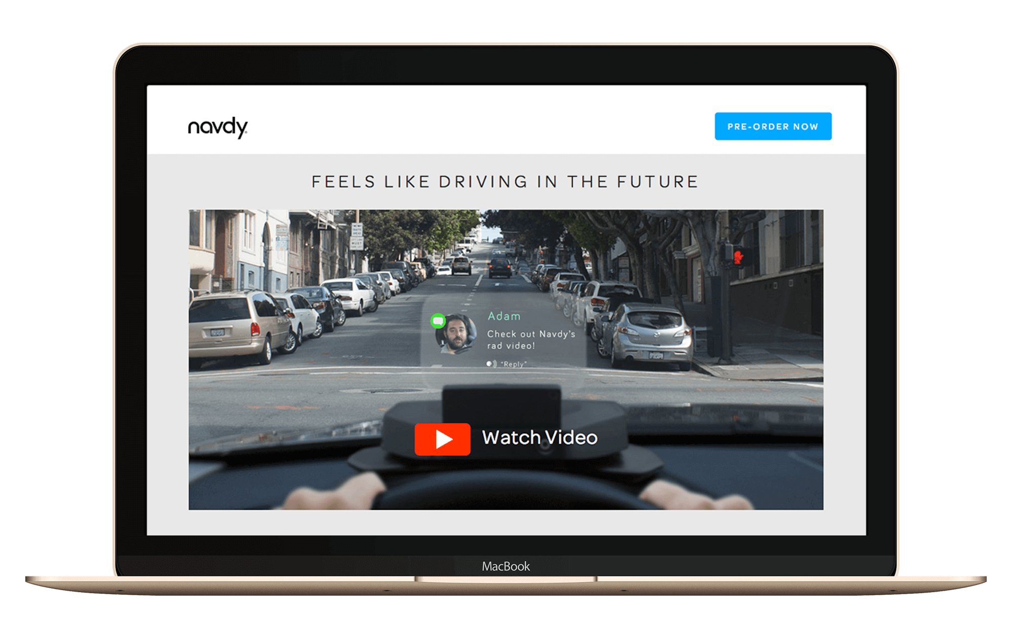
- Navdy, a smart head-up display for any car
- Cruise, autonomous driving overhaul kit (before their GM acquisition)
- Eero, one of the first mesh wi-fi router solutions
- Embr, a watch-link device for instant cooling / heating of your whole body
- Anki Vector, a smart robot companion
- Away, a DTC luggage brand
- Sunflower Labs, an autonomous security drone
- Eight Sleep (formerly Luna Sleep), an intelligent mattress cover
- Shipt, who sold their initial grocery delivery memberships using the platform (before their acquisition by Target)
Pre-Order Deposits
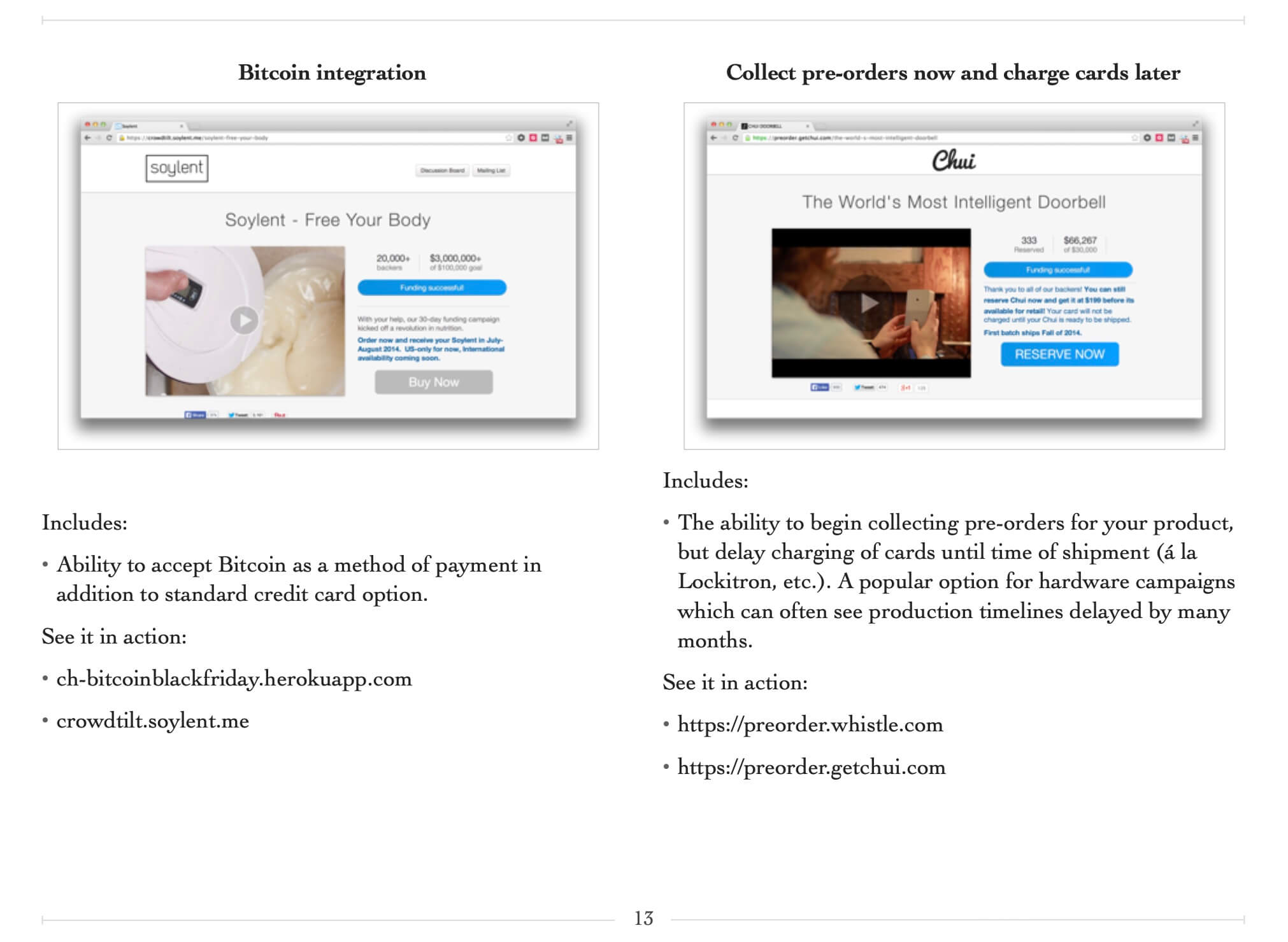
Drawing inspiration from Tesla’s Model 3 pre-order launch campaign, we built out the ability for customers using Tilt’s Pre-Order product to collect a deposit amount (e.g., $95 on a $799 product) upfront and charge the remainder at time of shipping.
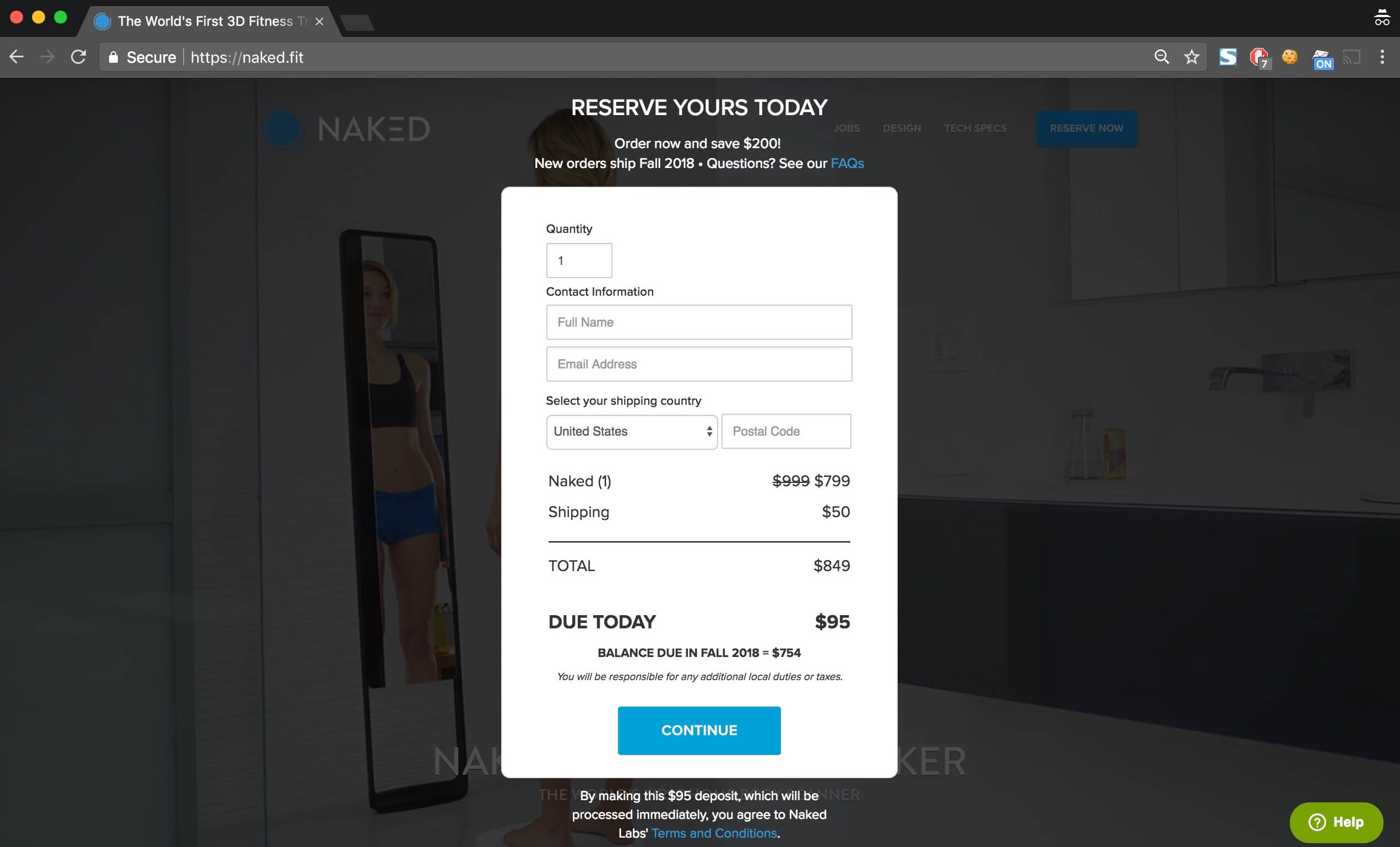
We knew we needed to be quick with this one to capitalize on the moment, so we rented an Airbnb a few blocks away from the main office. Working backwards from the launch blog post we wanted to share, we built out the landing page and all the product functionality over a few days.

Above: putting the finishing touches on my part of the Deposits feature during our "Hackation"
This new Deposit functionality led to the next step function of growth for our Pre-Order product. We were first to market with this feature and this gave our growing sales team a huge point of differentiation.
Notable Pre-Order Deposit campaigns
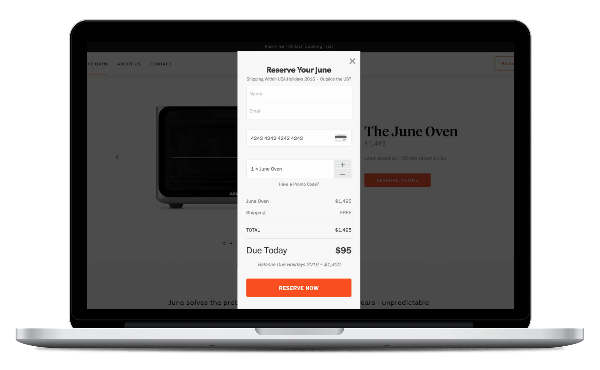
Some of my favorite brand partners that I worked with on this feature:
- Boosted Boards
- Naked Labs
- June Oven
- Lytro Illum
- Lily Camera
- Whistle, pet GPS tracker
Partnerships
In a push to grab some big names and press hits, I helped run technical due diligence and develop custom crowdfunding products for national brands, including:
- AMC Theatres
- Burt’s Bees
- Dick’s Sporting Goods
- Chubbies
- Right to Rise (Jeb Bush)
- San Francisco Unified School District
Most of these partnerships were not ultimately worth the squeeze for the logo on the landing page (the long timelines / meeting time sink that comes with large organizations don’t match the speed of early-stage startups), but I’m incredibly grateful for this time where I overlapped and learned from Mike and Dan.
Writing an Ebook
As the broader team at Tilt grew beyond 50 people and introduced a Sales / Biz Dev function, it became important to share the historical context of what our small “Skunk Works” team was working on.
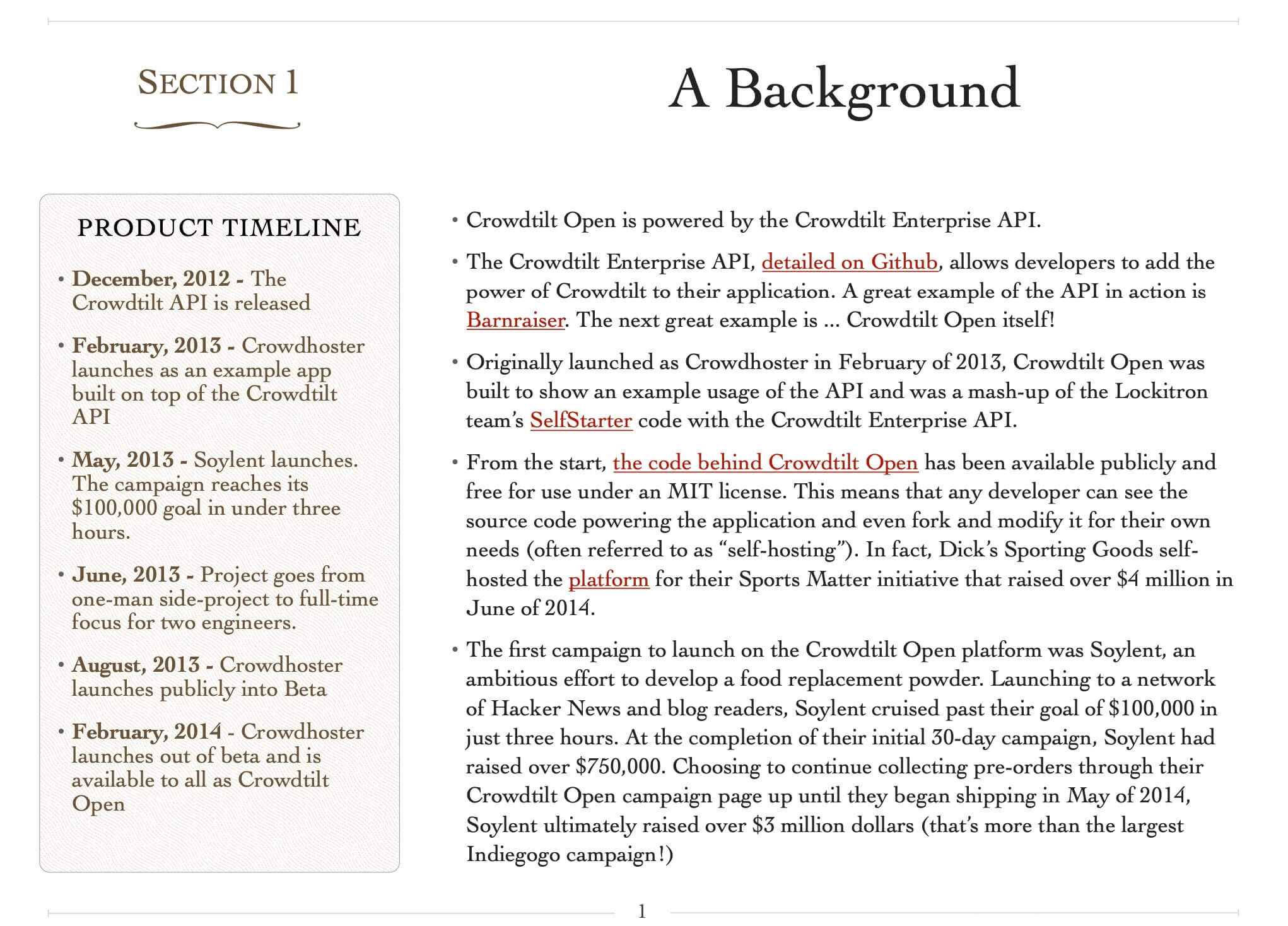
I spent a weekend writing an Ebook, From Lead To Launch, to share with the company. It was part biography, part user guide, and part tactical lead qualification checklist.
A few selections from this book are included below:
Launching a hosted product, Crowdtilt Open
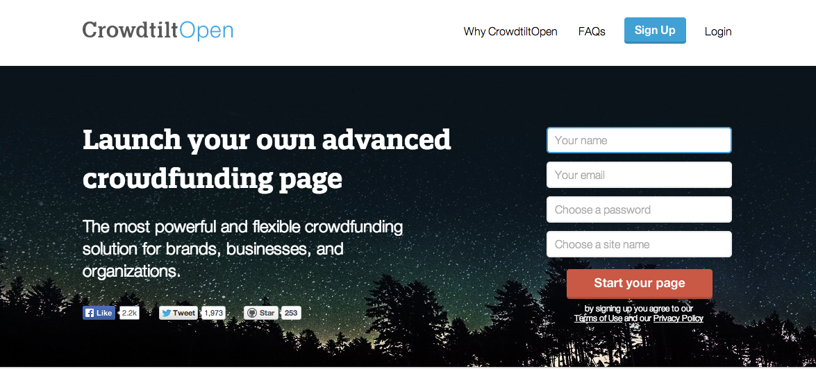
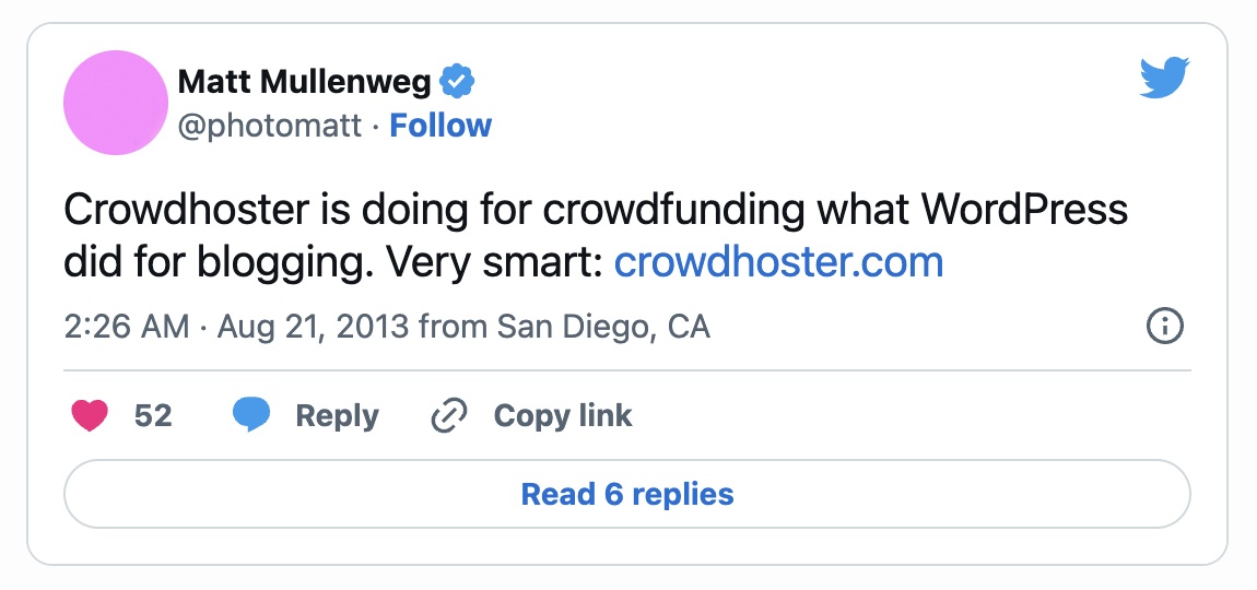
Following the success of the Crowdhoster open source project in 2013, we started working on a commercial version of the platform that users could launch without touching any code.
The result was Crowdtilt Open, which brought an influx of new users to talk with each day and a variety of use cases to support.
Growing Crowdhoster
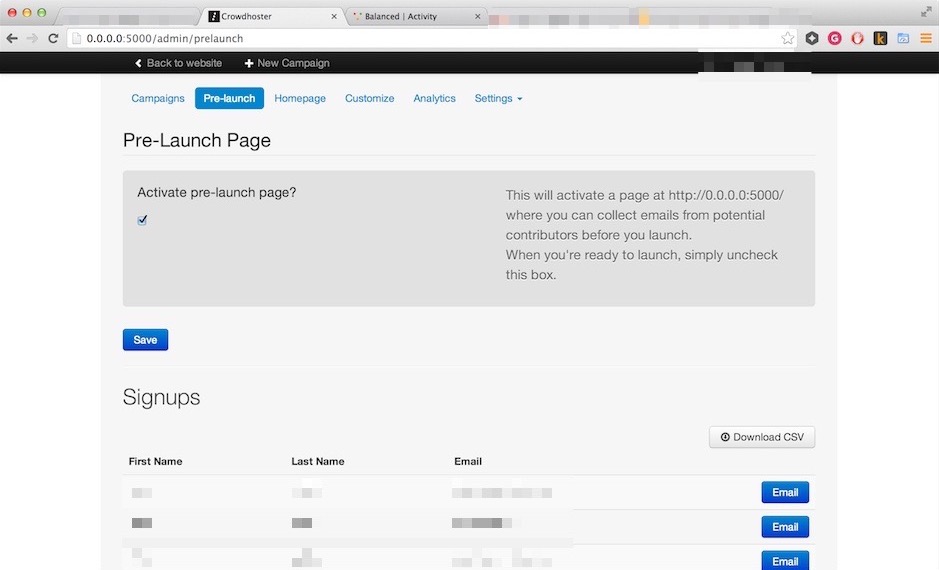
During this “golden age of crowdfunding” (Pebble, Soylent, Oculus Rift, etc.) I helped creators launch their projects and built a suite of customization features. We let users customize almost everything about the campaign page with HTML / CSS, so we created lots of documentation and hand-built pages for VIP campaigns.
This focus on customization / theming helped Crowdhoster become the most deployed crowdfunding project on GitHub.
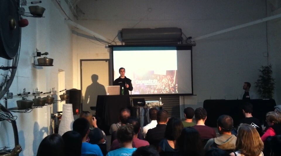
I had a blast sharing Crowdhoster at local meetups, meeting founders working towards crowdfunding launches, and going back to the office the next day to build out new product features they’d asked about. Crowdhoster was a Ruby on Rails project and it was an amazing platform for hacking on.
Notable Crowdhoster launches
A selection of the crowdfunding campaigns I worked on with Marc, Ajay, James, and Henry in 2013:
- Soylent launched on Crowdhoster after Kickstarter declined to host their campaign.
- The Bay Lights project that kept the light installation on the San Francisco-Oakland Bay Bridge lit from 2014 - 2023.
- Foo Fighters Fans used Crowdhoster to bring the band to Richmond, Virginia, a city which they hadn’t played in 15 years.
-
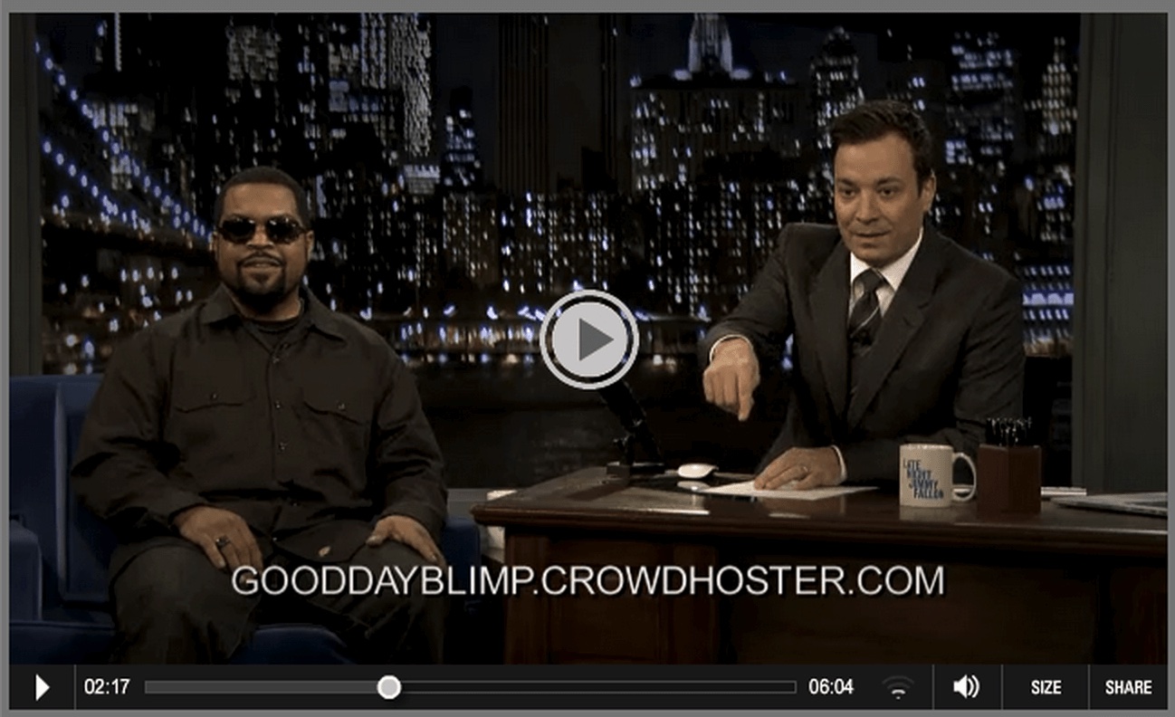
And Ice Cube’s Goodyear blimp:
Open source development
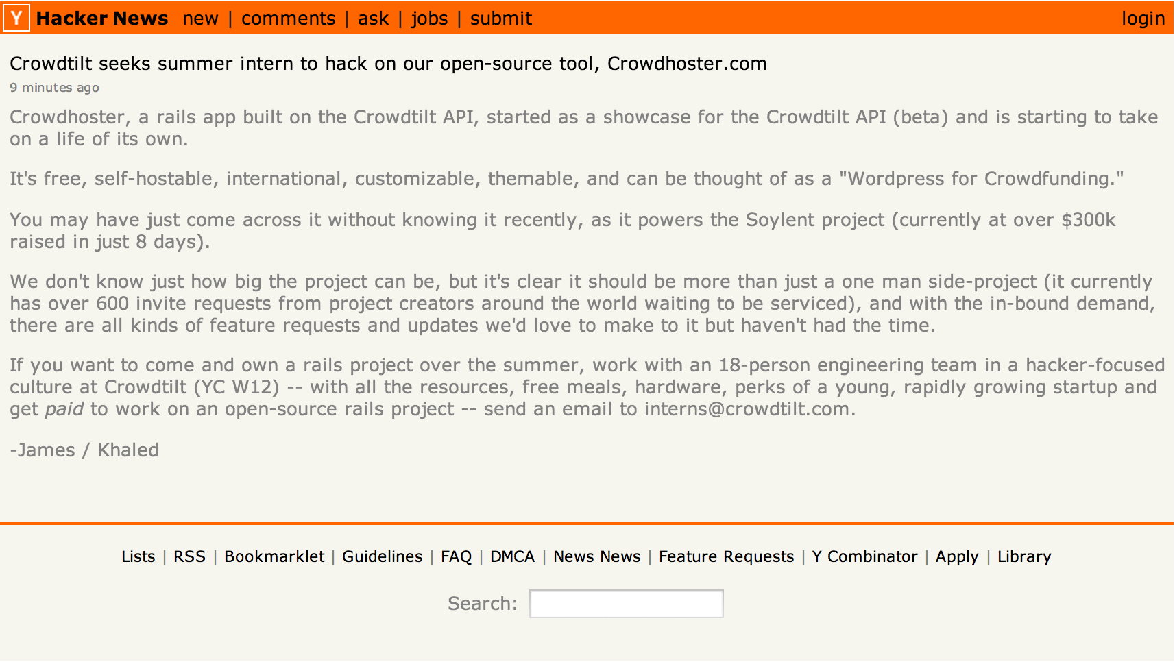
I merged my first open source pull request to Crowdhoster (a fork of Selfstarter by Jarred Sumner / Lockitron) and joined Crowdtilt (via this Hacker News post sent to me by Weston) to work on the project full-time alongside Marc, Ajay, and James.
Thanks!
This page was built with several open source libraries and great tools that I’ve highlighted below.
Open source projects:
Tools:
